“The Farm”
One of the fantasies of modern art is that it’s possible for an adult artist to paint with the freedom and creativity of a child. So pervasive did this idea become in the mid-20th century that it replaced the conventional wisdom that great art required the acquisition of great skill.
The modern alternative was that creativity lay in shedding inhibitions and casting off technique to unleash the primitive, childlike self.
It’s safe to say that no idea has ever produced so many bad paintings.
Joan Miro, the Spanish modernist born 100 years ago this year, was one whose work seemed to lend support to the paint-like-a-child theory. His pictures can look like childish doodles, what with their bright colors, meandering lines, and simple symbols of suns and stars.
However, as a huge exhibit at the Museum of Modern Art makes clear, the key to Miro’s success wasn’t in assuming complete freedom. It was something much more familiar: the acquisition of great skill.
Miro’s development was a long, painstaking process of working through the modernist vocabulary: fauvism, expressionism, impressionism, cubism. Only then did he arrive at that state of grace in which he seemed to create spontaneously.

“Blue II”
The show at the Modern is one of those blockbusters that spreads out over several floors, with chronologically organized galleries, a separate exhibit devoted to prints, a 500-page catalog, and the usual array of gift store memorabilia.
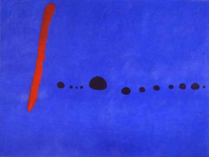
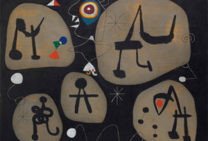
A typical Miro can look like a Tinkertoy creation: red and black blips connected by playful, wiry lines. Here and there, one can discern an eye, or a pair of breasts, or the outline of a bird. The pictures carry outlandish titles like “Woman with Blond Armpit Combing Her Hair By the Light of the Stars.”
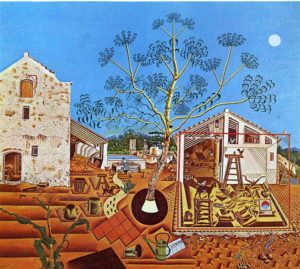
A key to Miro’s development can be found in his 1922 painting “The Farm.” Inspired by the Miro family farm outside Barcelona, it was once owned by Ernest Hemingway. Although all the elements of a farm are there – buildings, implements, tilled fields, and animals – it is a far cry from realism. Every object is presented in an artificial way, as if it had been cut out of another painting and glued to the canvas. The effect is dreamlike, a combination of Salvador Dali and Grandma Moses.
In this picture, you can see Miro straining at the bit, eager to break out of realism, but not quite sure how to do it. The break came in subsequent paintings, like “The Tilled Field,” or the “The Hunter (Catalan Landscape),” where he reduced the naturalistic elements to symbols. Instead of the furrowed fields there are wavy lines. The hunter has nothing more than a triangle for a head and a few lines for a body, and is recognizable as a human only because of a single eye, a moustache, an ear, and an oddly realistic pipe.
These were the last of Miro’s paintings to retain that naturalistic division between sky and ground. After this, the pictures are mostly horizonless, and the figures inhabit an amorphous space.

“Women Listening to Music”
Throughout his career, Miro vacillated between that modernist love of austerity and a baroque impulse to fill the canvas with lively action. So, in the 1925 “A Carnival of Harlequins,” we have something on the order of Calder’s “Circus,” a room packed with doodlebugs, windup toys, musical notes, guitars, mermaids, and other silly inventions. But in that same year, he painted the monumental-sized “A Birth of the World,” a somber image in which a few forms – triangle, circle, line – are arrayed on a background of blackish washes.
Of the two styles, cosmic simplicity is the less engaging. There’s something in Miro that wants to tell a story, and the paintings are more fun when there are protagonists and an array of objects. In “Dutch Interior (I),” he shows his affinity for those crowded northern paintings with their opulent displays of possessions. Some, however, are so obsessively packed with colored blips and circles, the viewer may feel that he’s lost in a ticker-tape parade.
An aura of solemnity often surrounds modern painting, so that it’s difficult to see when a picture is just plain funny. The painting titled “Potato,” for example, might just be called “Mr. Potato-head.” His figures have an amoebalike elasticity, suddenly sprouting a bulbous hand, a stalklike neck, or an insect-sized head.
Miro invented his own sexual symbolism. A woman is represented by a vaguely spiderish form. His portrayals of lovers usually involve some interpenetration of the two figures. The effect is no more erotic than, say, sex between two coat hangers.
Like those of his fellow Barcelona native, Picasso, Miro’s depictions of women are not always flattering. Their heads can resemble braying donkeys, the mouths flashing pointy teeth. But men fared no better.
In the “Constellations” series, Miro let out all the stops. He gave free rein to his calligraphic language, cramming the pictures with women, stars, moons, ladders, birds, and other wiry figures. It was as if, after a lifetime, he was trying to get the entire universe on canvas.

