There’s something strange in the neigh-bor-hood.
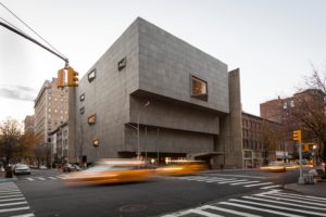
On Friday, The Metropolitan Museum of Art opens its new branch of modern and contemporary art in the former Whitney Museum. It’s “The Met Breuer” (after the architect who designed it). Those who love the Metropolitan had reason to hope that it would inject some curatorial sanity into a building notorious for its aesthetic horror shows. Instead, the ghosts that inhabit the Whitney seemed to have taken possession of the Metropolitan.
Who ya gonna call?

In the first place, the event is turning out to be more than just the unveiling of a new branch. It’s also the occasion for a bizarre fit of rebranding that affects the entire institution. The museum is simultaneously releasing a new, blocky logo, a two-tiered design that reads simply, “THE MET.” Aside from the awkward familiarity of replacing the august formal name with a cute nickname, the logo design (which leaked out a few weeks ago) has been universally panned for looking cockeyed and crowded, causing Director Thomas Campbell to fire back that critics are “logo obsessed zombies.”
Ghostbusters!

Before and after logos for the Metropolitan Museum.
To fit in with the Met Breuer branding, the museum’s elegant Beaux-Arts main building is being designated – in the same red lettering — “The Met Fifth Avenue” (which sounds a bit like a new department store), while its medieval citadel to the north shall henceforth be dubbed “The Met Cloisters.”
You can easily imagine the brainstorming sessions of publicists, advertising people and image-branders that came up with this. The same meetings must be responsible for the frenzy of promotion that has gone into the launch of Met Breuer — a manic program of press releases, previews, dance and jazz performances, commissioned music, art workshops, and family programs. There has never before been such a fuss at the Metropolitan – not for the visit of the Mona Lisa, not for the Temple of Dendur, not for a half dozen more important wings that it has unveiled over the past several decades.
The most hyped of the events are a series of 9-minute gallery talks on the idea of “the unfinished.” This is inspired by the inaugural exhibit, “Unfinished: Thoughts Left Visible,” a 550-year survey of incomplete art. No fewer than 30 minor luminaries – actors, writers, curators, choreographers, filmmakers, and other creative types — have been recruited to deliver their thoughts. Why nine minutes? Well, that’s the length of time it takes to walk from The Met Fifth Avenue to The Met Breuer. And, just to make sure things are really neat and cute, someone has figured out that it’s also the length of time it takes to walk from the entrance of Fort Tryon Park to The Met Cloisters ( taking into account, I suppose, that the latter walk is all uphill).

It’s the same old Whitney, inside and out.
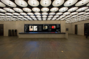
OK, so what does it look like? Well, here, too, things get strange. Not for what’s there, but for what isn’t. Prepare to be underwhelmed. The new Met Breuer looks remarkably like the old Whitney, identical on the outside (except for some quaking aspen saplings planted in the front moat). As for the inside, this too, is practically unchanged, unless you’re really into details like polished brass and wood grain. What used to be a book bar in the lobby has been made into a reception desk. Up on the fifth floor, you’ll find a coffee bar.
The lack of substantive changes isn’t so surprising given that the Metropolitan doesn’t own this place. It has an eight-year lease with the Whitney that is costing millions. Was the Metropolitan desperate for space to exhibit modern and contemporary art? Not at all. It already has the Lila Acheson Wallace Wing, completed in 1987, which has more space than the Whitney building. But it’s somehow not enough, or the layout is wrong, or something, because there are long-term plans to tear it down and build a bigger and better one.
Meanwhile there’s the “Unfinished” exhibit. This is a big, messy show, an act of curatorial free association with a little bit of propaganda thrown in. But it’s got some great, and sometimes provocative, individual works. Get off the elevator on the third floor, a location where the Whitney used to put some nutty thing, like a pile of stuffed animals or a punched-in wall, and you’re confronted by something almost as shocking — Titian’s “The Flaying of Marsyas,” a gruesome image of a satyr being skinned.

Scholars are still guessing at why it’s so blurry. Was it a new late style? Had the artist gone soft in the head or cloudy in the eyes? Whatever. The point, made here and elsewhere –in 19th century oil landscape sketches, in misty semi-abstractions by Turner, in the oft puzzling Cezanne paintings where passages were simply left blank – is that the modern sensibility finds merit in the unpolished and seemingly incomplete.
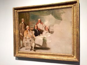
This, oh-hum, was the path to abstraction, a lesson the Museum of Modern Art has been dogmatically preaching for half a century. Except this show throws in a whole bunch of paintings that were left half done because the artist died, lost the commission or who knows why. These curiosities are sometimes fun to look at. There’s a big Rubens battle scene in which a fighter has three arms because Rubens was still figuring out the pose. But they add nothing to an art historical progression toward less is more.

And there are some curatorial blunders, such as an unfinished portrait by Manet. Manet fits right in to all this because his flat patches and shorthand strokes made his paintings look “unfinished” to contemporary viewers, although, as we know, this style led to impressionism. A finished Manet might have made the point so much better.
It’s when you get to the contemporary works that you realize that the end of the modernist progression envisioned here isn’t Matisse or Jackson Pollock. It’s conceptual art, in which the idea – not the object – becomes all important. Process is at the heart of a stunt called “Lick and Lather” by Janine Antoni. She made two identical busts, one of chocolate, one of soap. She licked the former and bathed with the latter. The soap one ended up much smaller, therefore proving…
The other, smaller exhibit consists of minimalist grids and other linear diagrams by Nasreen Mohamedi, an Indian artist who died in 1990. This, like most minimalism, is intended to be formally elegant and profoundly simple, but is thin gruel for viewers hungry for something to look at.
Oh dear. What is happening to the Metropolitan? Many are applauding its leap into the art of our time. Never mind that this is something already well staked out by the Museum of Modern Art, the new Whitney, the Guggenheim, and the New Museum. The Metropolitan has always been beloved for its grandness, its high standards, its grasp of 5,000 years of art history. It’s the city’s number one tourist attraction. It doesn’t need to prove its relevance.
Nevertheless, it seems possessed by the need to be cutting edge. Did someone say possessed?
Who ya gonna call?

