Remember when a sign was just a sign: “Drink Coke” with a picture of someone doing just that? Or, when a book cover was just the title of the book in simple block letters and maybe a picture of two people embracing? Or when every corporation and political group didn’t have a logo, or when children’s books didn’t mix 10 different typefaces, and newspapers were just black and white with no four-color charts and computer composite photographs?
Nostalgic for that world? It was only 15 years ago, but seems longer, so much has changed in graphic design since then. Whether you think the world is now over-designed, has gone crazy for sheer visual excitement over substance and clarity, or whether you think the once dull and unimaginative has been wonderfully enlivened, is no matter. Graphic design has a life and a will all its own now and no longer feels subservient to the underlying message once assumed to be its primary purpose.
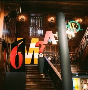
“Mixing Messages: Graphic Design in Contemporary Culture,” at the newly redesigned Cooper-Hewitt National Design Museum is a gleeful, festive-looking exhibit that perfectly illustrates where we are today, and how we got there, while skirting the style-over-substance question that might engage a skeptic, or any thoughtful person. The very exhibit itself, with its jazzy installation on modern partitions that only partially obscure the dark, carved-wood interior of the old Andrew Carnegie mansion, seems to embody the sense of an energetic, almost virus-like aesthetic that has supplanted an earlier zeitgeist of dignity and decorum.
As organized by Ellen Lupton, the museum’s curator of contemporary design, this is an exhibit of which it might be said, as Marshall McLuhan did back in the Sixties, that the medium is the message. Among its amusing highlights is a full-scale newsstand with screaming tabloids and rows of candy boxes, of which the best is still the old classic pink-and-white Good and Plenty. Mostly though, this is a show that celebrates the vanguard of design, the screwball wristwatches of Tibor Kalman’s M & Company, or the cartoonish, underground look of wheat-pasted posters found on construction fences and blank walls in New York City.
The show is organized thematically, opening with a salute to “The Street,” the urban billboard, with its gigantically scaled advertisements for products, events, and political causes, and the hand-pasted rock and nightclub posters mounted in multiples like a sheet of stamps, recalling the repetitious aesthetic of Andy Warhol. Here, too, can be found a facsimile highway sign for Walt Disney World, which mixes highway-sign language with Disney’s stock-in-trade: Mickey Mouse peering over the top of a sign marking the exit to Disney World and MGM Studios.
The section on “Typography,” the design of letters, begins by showing how classic typefaces evolved, then leaps into the current revolutionary atmosphere in which letters have been bent, twisted, fractured, exploded, and pushed side by side with seemingly incompatible neighbors. Much of this is amusing, as when a letter or word is made to become the thing it expresses as in the splintered, edgy lettering of the word “Crackhouse,” by designer Jeremy Dean.
When letters begin to blur, and invert, and are organized on the page in radically non-linear arrangements, and when images and text are so fused – as in the work of Katherine McCoy, an influential teacher at the Cranbrook Academy of Art in Michigan – vertigo begins to set in, and the viewer feels thwarted in the effort to penetrate the design overload.
When this exhibit does ask questions, they are the kinds of questions that would only bother the fully converted, as in the section on “Identity,” which deals mostly with corporate logos. In the book that accompanies the show, Lupton ponders the appropriateness of a vanguard sensibility being appropriated by corporate America. But, after all, isn’t selling and commercialism what graphic design is all about?
Here we see the famous icon for Bell Telephone, which in the Sixties had a remarkable 93 percent recognition rate in the United States. But we also see logos for political groups, as well, such as that for ACT UP, the AIDS Coalition to Unleash Power, with its pink triangle over the slogan “Silence = Death.” The pink triangle recalls the pink tags sewn on the sleeves of homosexuals in Nazi prison camps, while its inversion is meant to suggest resistance and strength.
The exhibit concludes with “Publishing,” a section on books, displayed in Andrew Carnegie’s library and a small room outside it. Books, seemingly too staid to dance in this company on their own, are dangling from strings, as if to give them added animation. We do sense a little restraint in the design of the covers – you can almost always make out the title and the author – as if somewhere, in some publishing house, someone is still saying “Hey, this is a book, not a rock poster.”

