 Color was always secondary in Picasso’s art. His radical reinventions of painting had to do with twisting forms, flattening space and rearranging people’s faces and limbs. “Color weakens,” he is reported to have said, which explains why such a competitive artist would have ceded that ground to colorists like Matisse and Chagall.
Up until now, however, no curator has thought to make an issue of this. Picasso’s works are generally organized by his styles: analytic cubism, synthetic cubism, neoclassicism, surrealism and so on.
Now, in “Picasso Black and White,” the Guggenheim Museum has plucked work from all phases of his career to make the case that Picasso was deeply monochromatic.
Curator Carmen Giménez even commandeers works from the so-called Blue Period to get her point across. A melancholy painting like “Woman Ironing,” may take some of its mood from the pervasive blue tint, but the painting is monochromatic nonetheless (blue functions as black), and, as print versions of this and other Blue Period works show, the conversion to pure black and white takes little if anything away from the picture.
Cubism in its early, analytical days was often strongly monochromatic. Part of its effect came from the reduction of forms to geometry. You can see Picasso working this out in such drawings as the 1909 “Head of a Man,” in which the face is broken down into neat planes with sharp edges.
Likewise, in more complicated compositions such as “Accordionist,” the cubist distortions of space are achieved by graphic means – with lines and monochromatic shading. Picasso shattered the image, then shaded the edges of the reassembled shards to bend them back into space. The mind keeps trying to read the cues for a third dimension, but it never opens up. Despite all those little shaded edges, the composition remains as flat as a scattered deck of cards. Adding a lot of color would have turned an elegant paradox into chaos.
In the sensitively rendered head of “Man with a Pipe,” you see Picasso has emerged from the cubist maze into his neo-classical period, and with his all his powers of draftsmanship intact.

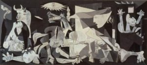
Picasso’s best-known black-and-white work is undoubtedly “Guernica,” his reaction to the bombing of a Basque village by fascist forces in the Spanish Civil War. The mural explodes outward with images of suffering animals and people in a crumbling structure. That painting, which hung in the Museum of Modern Art for many years, stays in Spain now, but it is represented here by a study of a horse’s head thrown back in agony.
The use of black-and-white is at once funereal and somber while also referencing newspaper photos of the period. He used a similar style in “Charnel House,” which was painted in 1945, when news of the death camps began to filter through Europe. The painting utilizes the same flatish, cubist space as Guernica, but differs, in that it seems unfinished, the lines fading into thin air. It’s as if the truth in this case was too horrific to render in a mere painting.
Giménez, who, like Picasso, is Spanish, points out the important part that black played in the works of such Spanish painters as El Greco, José de Ribera, Francisco de Zurbarán, Diego Velázquez, and, especially, Francisco de Goya, whose black period was rife with nightmarish images.
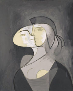
The strongest works of this show are from the 30s and 40s, a time when Picasso was finished with all his formal experimenting and could use his powers of distortion in an almost playful way. You see it in portraits of his lovers, Dora Maar or Marie-Therese Walter. Sometimes their eyes bunch up on one side of their nose, other times they lean back into a crossfire of cubist lines. These effects might be jarring, but the use of black-and-white bestows a simplicity and purity that makes them easier to digest.

