It used to be said that “a woman can’t be too rich or too thin.” In the museum world, the expression might be “you can’t have too many galleries or too big a lobby.” Today’s museums all want grander atriums, stylish restaurants, auditoriums, bigger gift shops, study centers and, of course, more exhibition space.

There are lots of reasons for this, but the best explanation is that the art world is awash in money. As the value of art soars into the stratosphere, the institutions feel they must grow more opulent, too. Bricks and mortar are cheap compared to art, so museum fundraising often exceeds expectations.
The Whitney Museum of American Art had been trying to do the expansion thing for 30 years. Again and again, it was knocked down by the New York City Landmarks Preservation Commission. Finally, it ran away from its home at 75th Street and Madison Avenue, abandoning its iconic building and privileged location to build anew in the trendy Meatpacking District.
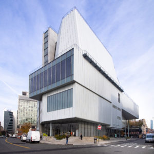
The building that opens (Friday, May 1) is every Whitney fantasy come true. It’s grand in scale, with all the extras that museums want today. It nuzzles up to the High Line, that hulking railroad trestle turned elegant pedestrian promenade and major tourist artery.
Designed by architect Renzo Piano, the new building is in many ways the opposite of the old. The 1966 Marcel Breuer building had an uneasy relationship with its Madison Avenue setting. Its “brutalist” architecture gave it the character of a bunker, as if it were defending its avant-garde values from a hostile neighborhood. Its granite facade was stubbornly opaque with only a few small, eccentrically placed windows.
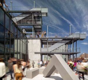
The new building at the corner of Gansevoort and Washington Streets embraces its cooler neighborhood with a transparent lobby of floor-to-ceiling glass and a pleasant outdoor plaza where potential visitors can hang out, perhaps deciding whether to pay the $22 admission.
The museum carries this transparency up into the galleries where picture windows provide panoramic views of the slate-blue Hudson River and Jersey City. Near one, curators have juxtaposed a George Bellows’ painting of a similar view.
The indoor-outdoor flow is also evident in the four upper floor terraces. These display sculpture and installation art and are playfully connected to each other by outdoor stairways, sort of like a vertical extension of the High Line below, affording odd views of rooftops and water tanks in its mostly low-profile neighborhood.

The new museum is not just moderately bigger than the old one; it is more than twice its size. It has galleries the size of warehouse floors with no pillars to break up the view. Architecturally, however, it is no match for the old. Whatever you thought of the Breuer’s inverted ziggurat and aggressive thrust, it was a powerful aesthetic statement. The new eight-story building, a jumble of unintegrated forms, could easily be a hospital or a university building,.
Inside, it has industrial chic echoes of the Meatpacking District, with factory-style stairwells and pine floors salvaged from old manufacturing plants.
The inaugural exhibit, “It’s Hard to See America,” is a reminder that the best thing about the Whitney is its permanent collection. It retells the story of American Modernism, beginning with the gritty realism of the Ashcan School and the machine-age odes of the precisionists. Here can be found old favorites such as Alexander Calder’s wire-sculpted “Circus,” Edward Hopper’s moody “Early Sunday Morning,” and one of Georgia O’Keeffe’s haunting animal-skull paintings.
Descending from the eighth floor gallery, you pass through Jackson Pollock’s drip pictures, Andy Warhol’s pop, Carl Andre’s minimalism, so-and-so’s post-minimalism and all the other isms. The art gets progressively more unruly until, by the fifth floor it’s poking through walls, flopping on the floor, blinking, flashing and vocalizing. You’ve arrived in the world of contemporary art.
With the exception of the Metropolitan Museum, which has expanded tastefully to accommodate its encyclopedic collections, it’s hard to think of a museum that’s been improved by inflating its size. Leonardo da Vinci said that small studios discipline the artist’s mind, but big ones distract it, and there’s an analogous principle that applies to the scale of museums. Some, like the Museum of Modern Art have become colder and more corporate as they’ve swelled. In a truly disastrous expansion, the Whitney’s architect, Piano, managed to make the elegant library museum of J.P. Morgan feel like a dingy appendage to the swank atrium addition, an architectural case of the tail wagging the dog.
On the one hand, it’s nice to see the Whitney find a neighborhood that it likes. On the other hand, you have to wonder if being a little constrained might have been a healthy thing for a museum that has long been short on self control. You have to ask, does our culture really need bigger Whitney biennials?

